Rose Botanics
I created a logo and brand identity for a flower shop concept. The aim of the brand identity was to connect with their customers through the things they love; flowers and houseplants, classic beauty and aesthetics that reflect peace and harmony.
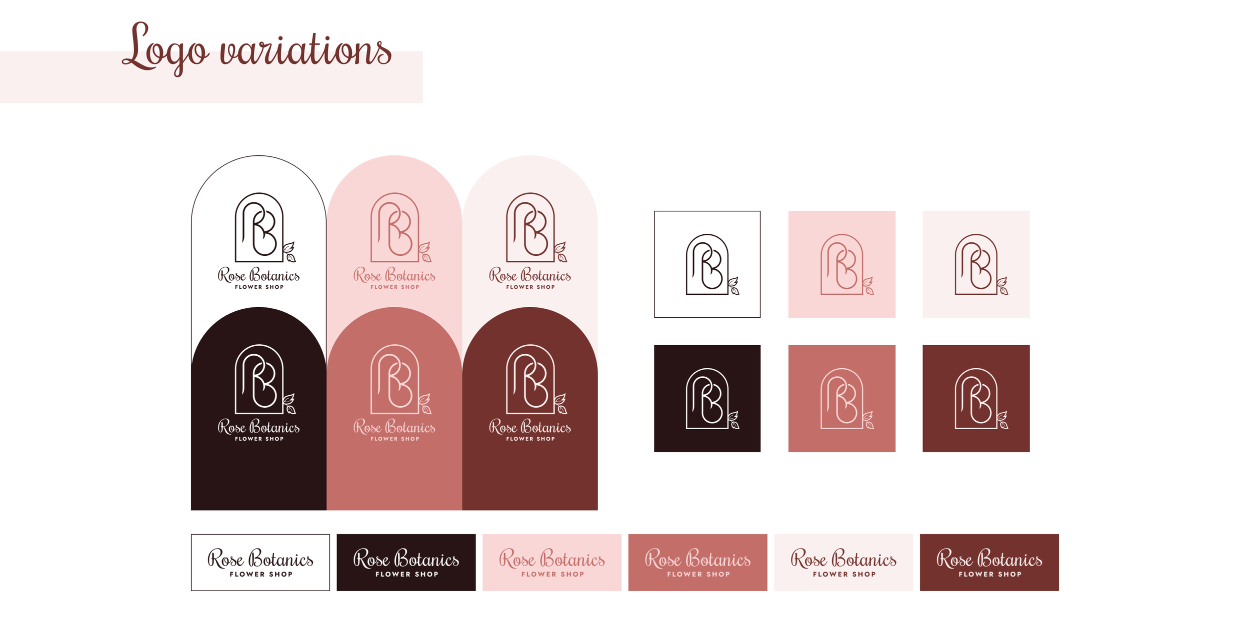
The Rose Botanics logo combines text - the company’s name - and minimalistic line art. It depicts the letters R and B inside an archway-like frame decorated with a pair of delicate rose leaves, thus waking up images of a door to a secret garden. The logo operates as a visual symbol to the flower shop, therefore it is a vital element in strengthening the brand identity.
- conceptual project -


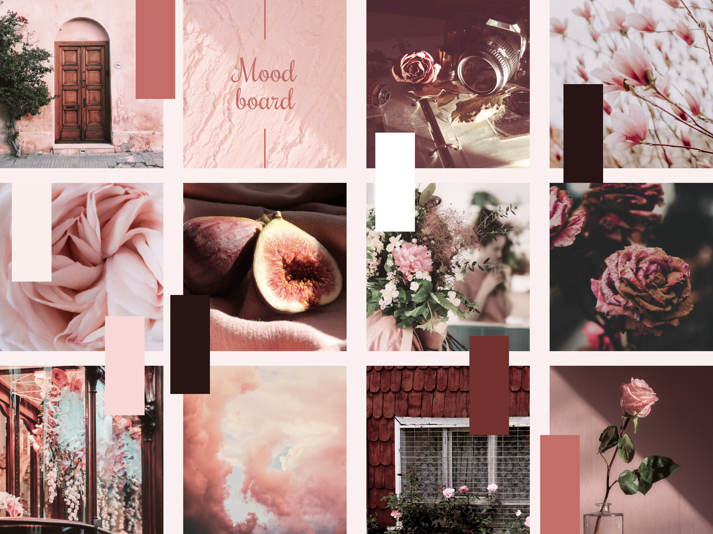
The main keywords for Rose Botanics Flower Shop’s brand identity are rustic, warm & feminine. Drawing inspiration from those elements, the brand palette consists of muted, natural tones of rosy red going from soft light to dark.


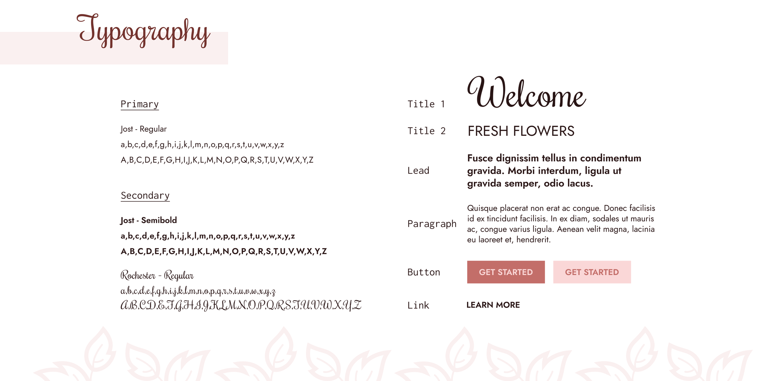
Jost is a versatile geometric sans-serif font that works great on screens as well as in print. Rochester is smart and classy, drawing its inspiration from the elegant calligraphy from the early Victorian era and Art Deco.