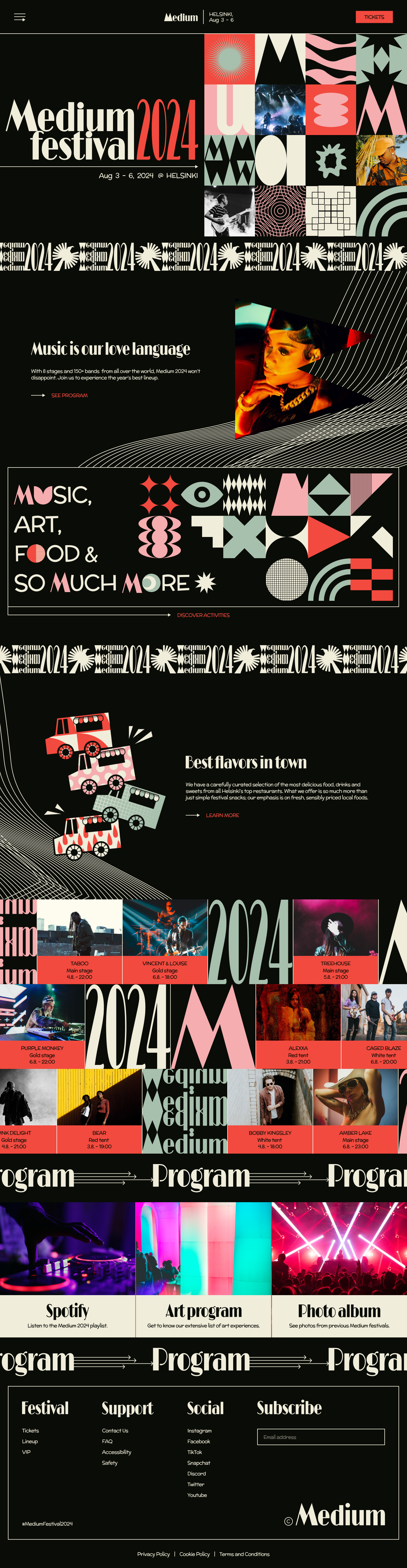
Medium
I created a visual identity for Medium, a conceptual music Festival. The project includes designs for the brand’s visual system, logo design, illustrations, print collateral and a website landing page.
WHAT IS MEDIUM?
Medium Festival is an urban music festival located in Helsinki, Finland. Their music genres include a selection of alternative rock, hip hop, pop and electronic dance music, both from Finland and the international music scene. The festival performs annually and goes on for four days. In addition to music, Medium includes workshops, activities and art exhibitions and provides a great variety of food options for the festival goers. The festival typically attracts 18- to 24-year-olds; this young demographic makes up a majority of Medium’s sales. The age restriction of Medium is 18+. About 150,000 people attend Medium each year, 56% of which are female. Medium’s main competitors are Roskilde Festival (DK), Flow Festival (FI), Weekend Festival (FI), Blockfest (FI), Way Out West Festival (SE).
- conceptual project -
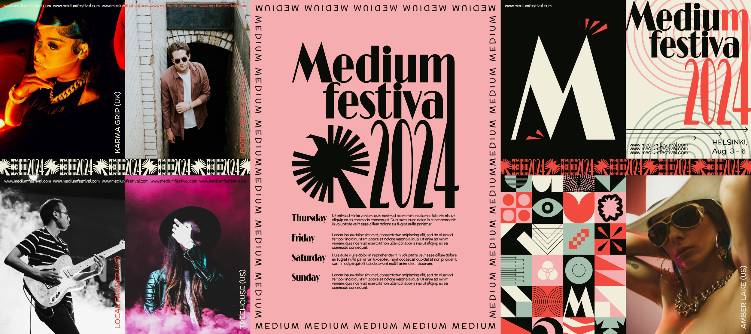
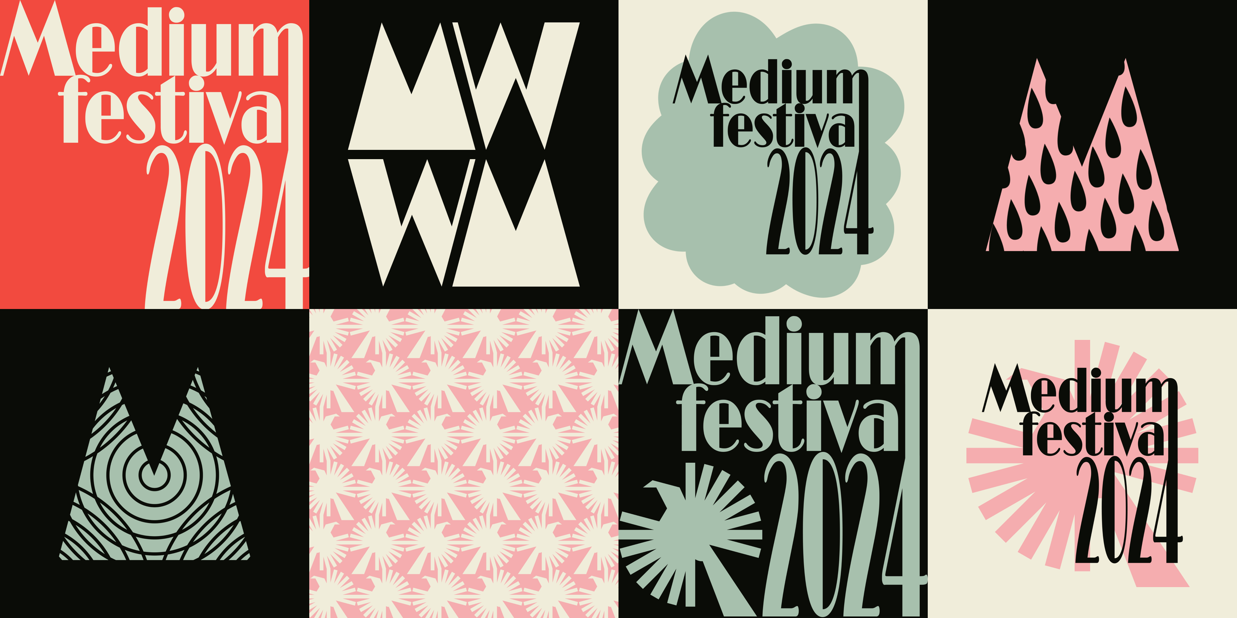
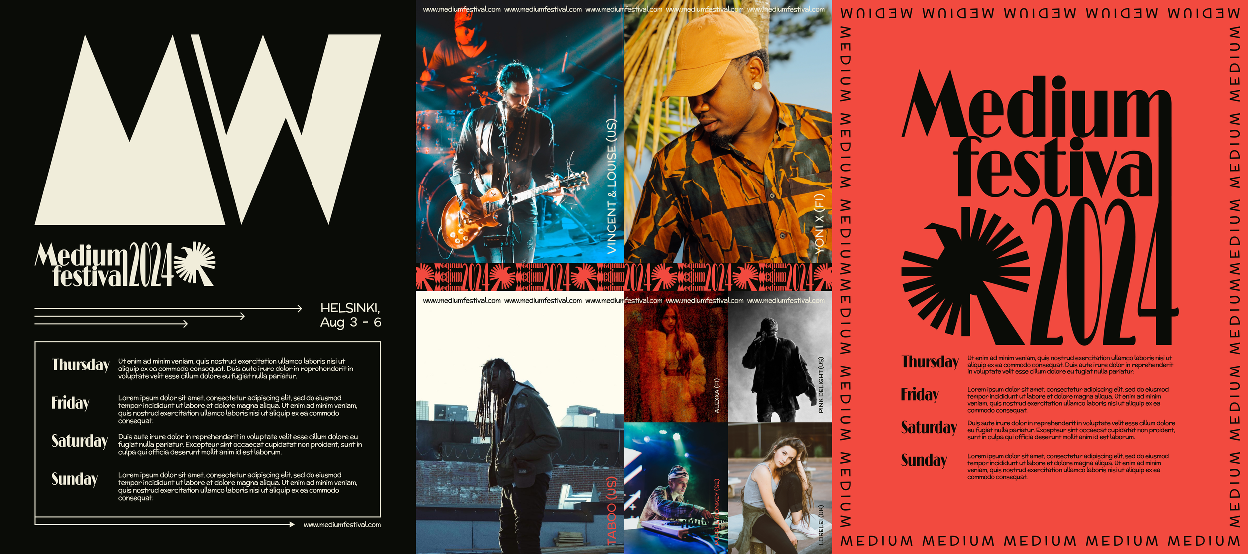
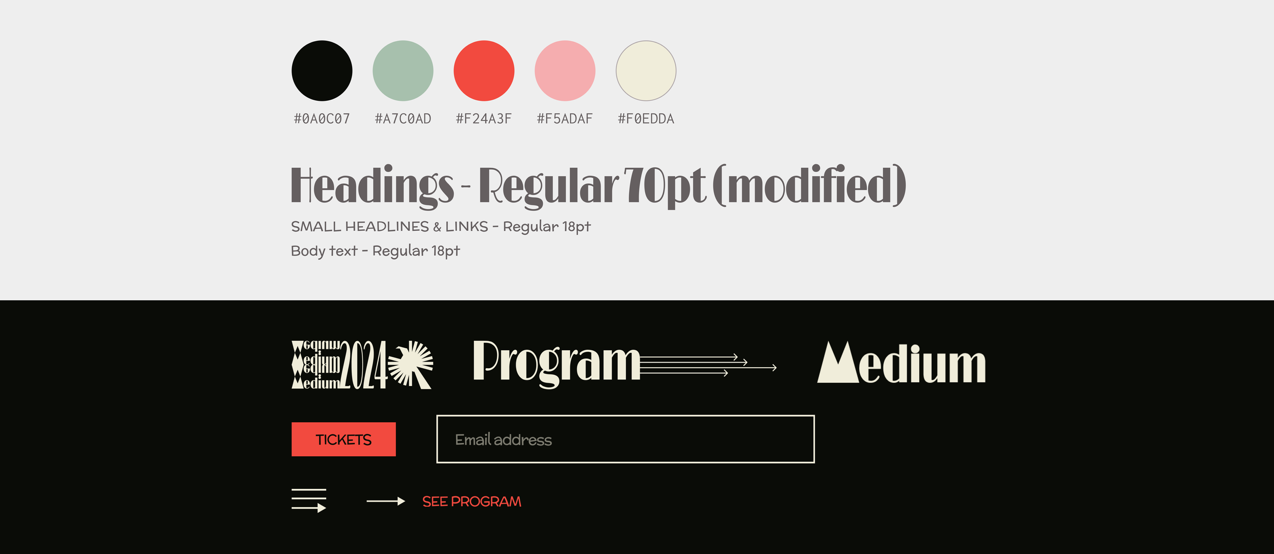
TYPEFACE
Limelight (modified), McLaren
Limelight is a version of a classic high contrast art deco style geometric sans serif typeface. I used this font selectively in large headlines and links as well as the logo design but modified it to be slightly taller and more condensed. This effect allows the design to really stand out and makes it more impactful. For the body text on the materials I used McLaren, a generic comic style typeface. I like it for its mildly playful yet clearly readable style, which suited this project perfectly.
COLORS
For this project my color palette needed to be two things: bold and daring. I went with a classic art deco combination; a deep black with a creamy white, accented with delicious, balanced mid-tones of green and red, as well as a more striking, fiery hue of red to bring that extra kick to the palette.
UI ELEMENTS
Since the website largely consist of playing with contrasting color combinations, large geometric shapes and flamboyant fonts, I kept the styling of the UI elements minimal and contemporary. Sharp lines and corners went well together with the overall visual style.
INSPIRATION
My main sources of visual inspiration for this projects were the symmetrical, geometric shapes used in art deco, the innovative and experimental attitude of modernism; as well as the orphic art of the late French artist Sonia Delaunay. I found that combining elements of these styles was a fun way to get the best parts of all of them and create a unique visual language for the project as a consequence.